Real SaaS Videos • Conversion Breakdowns • Copyable Patterns
12 SaaS Explainer Video Examples That Convert (With Detailed Breakdowns)
If you’re researching “SaaS explainer video examples,” you’re not here for pretty motion graphics.
You’re here to understand what actually drives demos, trials, and sign-ups — and what to copy for your own product.
Below are 12 benchmark-level videos (with breakdowns) showing how top brands hook attention, sell the mechanism, build trust, and land the call-to-action.
Quick Navigation
Jump to the examples, then steal the structure and answers buyers look for before they convert.
12 SaaS explainer video examples (with breakdowns you can copy)
These aren’t here to “inspire.” They’re here to give you patterns you can apply immediately:
hooks that stop the scroll, structure that makes complex products feel simple, and visual choices that build trust fast.
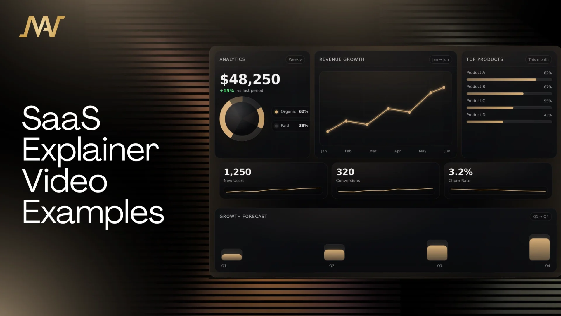
1) MAW Motion Studios — Intelligent Voice AI (Conversational AI Explainer)
Why it works:
Conversational AI is difficult to “see,” so this video focuses on outcomes first — what the agent does, what the business gets, and how it fits into real workflows.
The futuristic world-building boosts perceived value, while the UI moments stay clean and purposeful (no random “cool shots”).
Clarity before complexity: the viewer understands the offer before the technical layer appears.
Trust-by-design: premium aesthetic signals “enterprise-grade” without needing to say it.
UI discipline: only shows interface/actions that support the story and buyer objections.
Copy this: If your SaaS is technical, sell the real-world transformation first — then explain the mechanism.
Want a SaaS explainer built to convert?
We’ll handle the strategy, script, storyboard, and production — built for demos, trials, and sign-ups.
2) Notion — Communicates the “All-in-One” Promise Immediately
Why it works:
It communicates “one place for everything” within seconds. Instead of selling AI as a feature, it sells AI as speed and outcomes —
which is exactly how you beat AI fatigue.
Fast positioning: viewers instantly know what bucket Notion belongs in.
Outcome-led AI: the video shows results, not a chatbox.
Momentum: the pacing makes the product feel faster and more capable.
Copy this: If your SaaS is broad, lead with the unifying promise — not a feature list.
3) Miro — Hooks With Pain First, Then Makes the Solution Obvious
Why it works:
The first ~15 seconds validate the chaos (misalignment, scattered tools, unclear decisions). Then Miro arrives as the “single visual space”
where collaboration actually becomes visible.
Pain → relief structure: hooks attention before explaining anything.
Visualizes collaboration: makes teamwork feel real, not abstract.
Explains without teaching: the product is clear without turning into a tutorial.
Copy this: Your hook should sound like the buyer’s internal monologue.
4) Slack — Thesis First (“Work Is Broken”), Then the New Way to Operate
Why it works:
Slack starts with a belief, not a feature. That belief reframes the viewer’s reality — then Slack becomes the obvious center for communication,
coordination, and “how work flows.”
Strong thesis: creates instant attention and authority.
Energy without chaos: visuals stay lively, but the message stays clear.
Category expansion: positions as a hub, not a chat tool.
Copy this: If your SaaS replaces multiple tools, sell the new operating system — not the features.
5) Airtable — “Keep Up” Framing + Modern Workflow Messaging
Why it works:
Airtable frames urgency fast: the way work used to run doesn’t survive now. Then it sells familiarity (tables/records) with modern flexibility
(views, automation, “move faster” workflows).
Urgency that feels real: pushes attention without sounding gimmicky.
Why it works:
The opening visuals communicate “organized work” before the viewer even processes the words. The controlled pacing feels confident
(not desperate), which makes the platform feel more premium.
Design sells meaning: structure on screen = structure in real life.
Pattern break: stands out from generic SaaS explainers.
Controlled pace: holds attention without shouting.
Copy this: Your layout and motion language can sell the promise without extra narration.
7) Dropbox — Lo-Fi Meets Futuristic (Smooth, Direct, and Watchable)
Why it works:
It keeps the message simple and the motion smooth. Nothing over-designed — just enough polish to feel premium while staying direct.
Clarity wins: problem → solution → payoff.
Smooth motion: premium feel without distraction.
Easy to trust: doesn’t look like it’s trying too hard.
Copy this: When your product is simple, over-production can reduce trust. Keep it clean.
8) Asana — Sales-First Structure Disguised as an Explainer
Why it works:
It opens on collaboration pain and consequences, then positions the product as relief. It’s persuasion first, education second —
which is why it converts.
Hook is objections: it calls out real worries teams have.
Relief framing: order replaces chaos.
ICP-relevant visuals: nothing feels random.
Copy this: Write the first 15 seconds like a sales call: pain + cost + why it’s happening.
9) Grammarly — Real-Life Scenarios + UI Only When It Matters
Why it works:
It sells the human outcome first (confidence, clarity, better communication). Then it shows just enough UI to prove it —
without turning the whole video into a product tour.
Human-first persuasion: people relate before they evaluate features.
UI discipline: only appears when it strengthens the point.
Copy this: If your product improves performance, sell the feeling and payoff first.
10) Hootsuite — Hooks With Audience Reality, Then Sells Time Back
Why it works:
It starts inside the buyer’s world: social behavior, platform chaos, and the pressure to keep up — then positions the product as control.
Buyer empathy: “we understand your day” is the hook.
Clear promise: less chaos, more control, time saved.
Creative clarity: illustrations add flavor without confusion.
Copy this: If your buyer is overwhelmed, your explainer should feel like relief.
11) Figma — Older, Still a Masterclass in Communicating “Sync”
Why it works:
It makes a complex promise feel obvious: design, wireframe, prototype, and collaboration stay connected.
The visual linking shows relationships across workflow — not isolated features.
Connection storytelling: “everything stays in sync” becomes visual.
Workflow continuity: viewers understand the full loop fast.
Clarity over hype: explains without noise.
Copy this: If your product connects steps (A → B → C), show the connections on screen.
12) Pipedrive — Makes a Feature Tour Watchable (Without Boredom)
Why it works:
It guides attention so the viewer never feels lost. The “guide” concept turns a feature walk-through into a journey,
keeping retention higher while still explaining the product.
Guided focus: viewers always know what to look at.
Progression: it moves forward instead of dumping features.
Clarity with personality: watchable and understandable.
Copy this: If you must show many features, use clear progression + visual guidance.
The conversion blueprint behind top SaaS explainer videos
If you want your video to convert like the examples above, don’t start with features.
Start with belief, then mechanism, then proof, then a CTA that matches buyer intent.
High-Converting Explainer Structure
0–6 seconds: hook (pain, truth, or “why now”).
6–15 seconds: show the broken world (what’s failing today).
15–30 seconds: promise the after-state (the outcome buyers want).
30–60 seconds: mechanism in 3 steps (simple, visual, no jargon).
60–80 seconds: proof (credible outcome, use-case, or trust cues).
80–95 seconds: differentiation (why you vs alternatives).
Last 5–10 seconds: CTA (trial, demo, or call — based on buyer stage).
FAQ: SaaS explainer videos
How long should a SaaS explainer video be?
For most SaaS, 60–120 seconds is ideal. If the product is complex, keep the explainer short and follow it with use-case videos and onboarding.
What converts better: animation or screen recording?
Clarity + trust converts better. Modern SaaS often performs best with hybrid production: premium screen captures + motion overlays that guide attention.
Where should I place the explainer video on my website?
Most brands place it above the fold. If your product needs context, place it after the headline + benefits so viewers are primed before they watch.
What should the CTA be?
Match buyer intent: Start a free trial for low-friction tools, Book a demo for enterprise, or Talk to sales if there’s a real onboarding requirement.
How do I make my explainer not look generic?
Generic happens when there’s “style” but no sales structure. Use a strong hook, show the mechanism clearly, add proof early, keep UI shots purposeful, and end with a CTA that makes sense.
Want MAW Motion Studios to produce your SaaS explainer?
We build videos that look premium and sell clearly — built for demos, trials, and sign-ups.